
Archi
A mobile app for Architects to discover materials
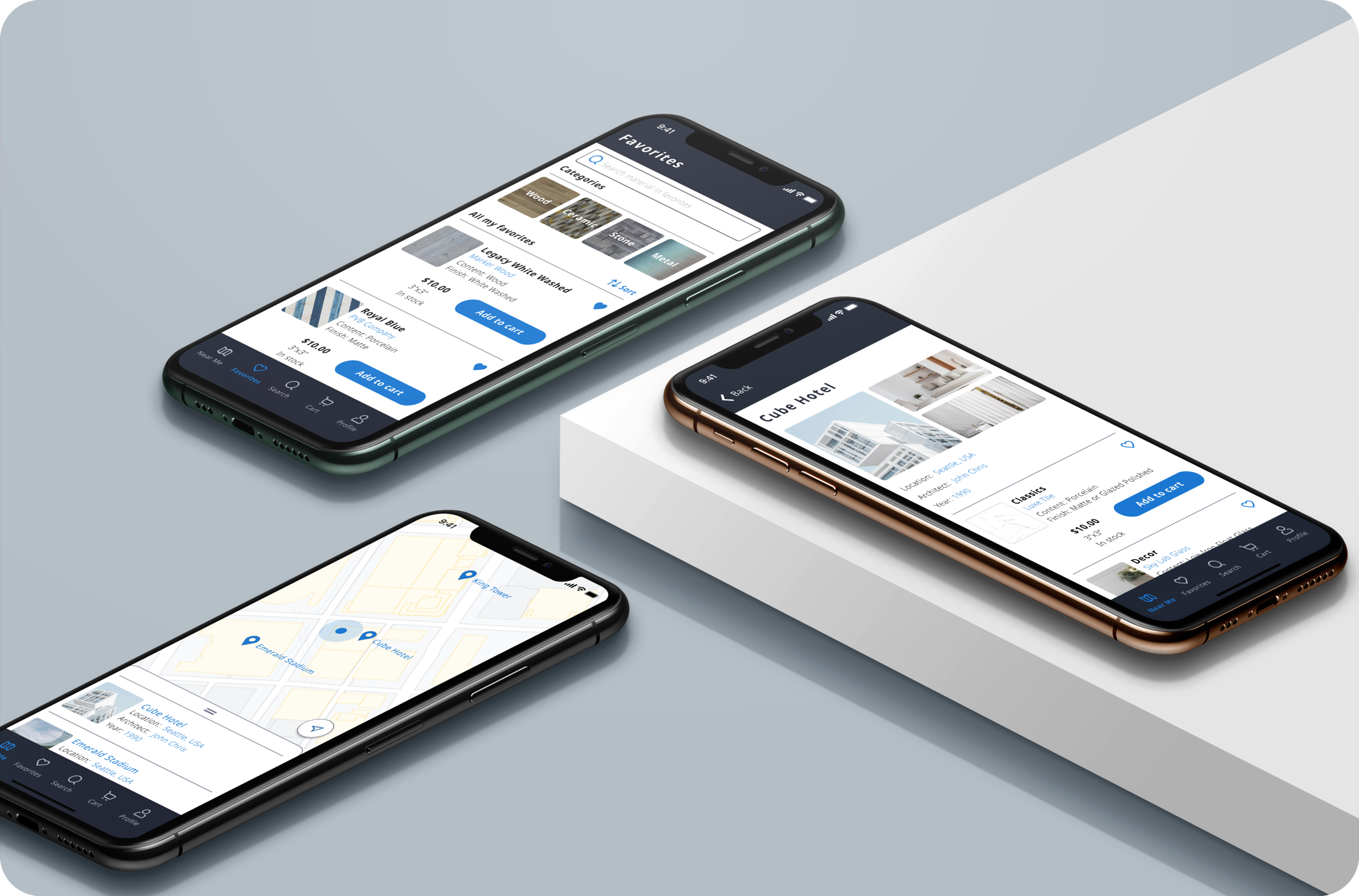
Let’s improve an architect’s work efficiency
The architectural industry uses advanced technology to help architects design the buildings more efficiently. There are some existing mobile apps for architects to sketch, measure, create plans and 3D models, but the architectural industry still has a lot of fields waiting to be discovered for app developers. This project will start from researching what architects need the most in their daily lives and see if there is any potential for a product to satisfy their needs.
The Goal
To discover what are the architect’s pain points during their work routine and develop a minimum viable product to solve the problem.
Pain Points
Difficult to research and collect architectural materials
Constraints
Limited time for testing and iteration
My Role
UX researcher,
UX/UI designer
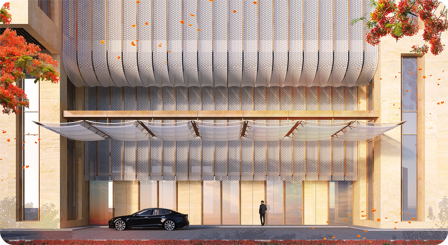
Why did I build an app for Architects?
Coming from an architectural background, I know there are some apps created for architects already, but most of them are not used often due to the capability of mobile devices, or the users just don’t think they are necessary.
I would like to use my architectural knowledge and explore if there is a potential product for architects and architectural buffs.
Empathize
Conduct Interviews & Affinity Map
The first challenge is to find out what pain points architects have right now during their work routines. Since I had limited time for this project, I decided to focus on the interviews for discovering the pain points. There were 5 architects joined the interviews.
“I think it’s annoying that sometimes the sample I received is not what I expected when I see it in person. ”
“There are so many brands and products to know because there are new materials invented everyday.”
“Sometimes the senior designer just tells us to check some projects and get the samples from that.”
“Sometimes I know there is one specific sample I really want, but I just can’t remember its name.”
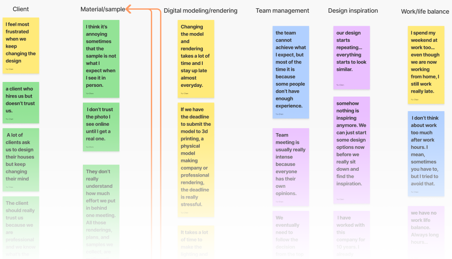
Pains
It’s difficult to collect and organize the material samples.
It’s difficult to find the suitable texture map for rendering.
A demanding client causes a tight schedule.
Repeating design work and heavy top management results in the team losing passion to seek the design inspiration.
Needs
To reduce the time for researching and collecting the material samples and texture maps.
Better management for the team and client relationship.
Findings
Architects are frustrated by two main pain points:
The process of finding out the details of materials and collecting them is not efficient. Currently there is no mobile app to help the designer to resolve this issue.
People who have more work experience are frustrated with the clients and team management due to the responsibility of the communication; junior designers are more frustrated with the production work.
Define
The two pain points I discovered are not suitable to be solved together in one mobile app. For this project, I decided to focus on solving the first pain point:
The frustration of researching and collecting materials.
One comment from the interview was the senior designers would ask junior designers to research the samples from specific buildings without knowing the names of materials. So I think having an ambitious junior designer who just started their career and has more responsibility of production work will be a good fit for my persona.
Eric’s POV
“I would like to know the information of the materials when I find it interesting on buildings.”
“I am frustrated that the samples I ordered are not what I expected.”
“I would like to help the team collect the material samples more efficiently.”
“When I see the material I like
I want to know and save its information immediately
so I can purchase a sample whenever I am ready.”
Ideate
So, how might we help Eric find, research, and collect material samples more efficiently?
With the job story I created, the storyboard was a way to convince people that Eric is struggling with the problem I want to solve.
Feature Roadmap & Sitemap
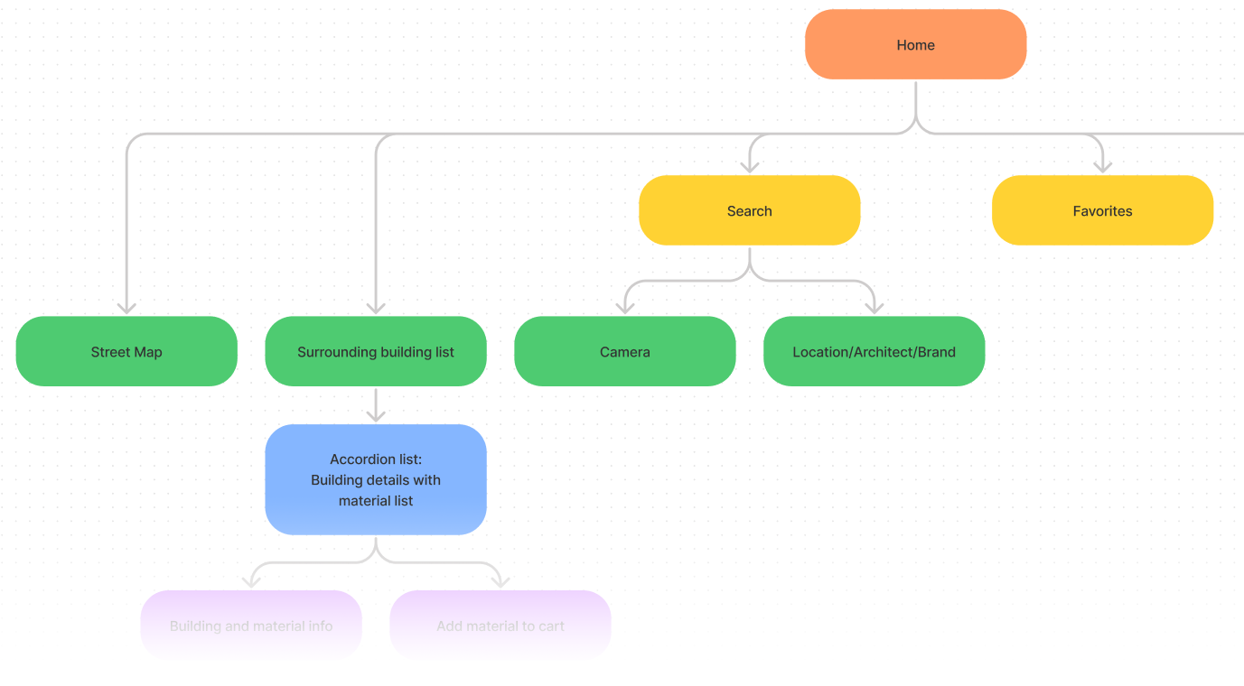
I developed a few ideas for the search feature. Here are four original methods the users could use:
Click the building on the surrounding buildings list
Click the building on the map
Take a picture of material
Direct search
Since the goal was creating a minimum viable product, the sitemap was simple but focused on providing multiple ways for users to find the info of materials.
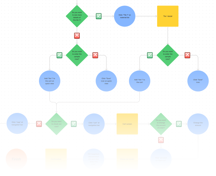
Task Flows & User Flows
Task 1: Select a building on the street map
You are staying in a hotel and interested in the tile on the lobby floor.
You would like to use the Archi app to find out the tile information and order a sample for your coming project.
Task 2: Take a picture of the material
You are staying in a hotel and interested in the tile on the lobby floor.
You would like to use the Archi app to find out the tile information and order a sample for your coming project.
When I was working on the user flows, I was aware that these might be too many steps for the user and could possibly cause confusion. I was preparing to run some tests during the design process and iterate the flows.
Design
I was planning to convert the sketches to wireframes and run some tests at the beginning. then I decided to design the brand of this app first, so I could have the whole branding concept in my mind when I work on the interface layout.
Archi is an app for architects, interior designers, and whoever loves to explore the materials. The concept of the logo is to have a structural feeling but also look like a fun building.
The goal of experience is to let users focus on the search and show the material information clearly, not drawing attention to the brand itself.
I chose the white background with dark blue palette so the user can focus on the material images with a calm feeling. The brighter blue is for call to action and clickable reaction.
Iteration
During the process of design, I ran user testing at various points and iterated the design on my way to the High-Fidelity mock-up.
Wireframes
There were 3 participants who joined the wireframe testing. 1 participant has work experience in the architectural industry.
During the wireframes testing, the camera function was not well received. No participant used this function to search the building info. The participants also pointed out there were too many steps to find the building detail and there might be too many buttons close together.
I decided to remove the camera function to avoid the confusion.
Mid-Fidelity Mock-up
There were 3 participants who joined the Mid-Fidelity testing. All participants have work experience in the architectural and interior design industry.
There was some feedback regarding the Favorites page during the Mid-Fidelity testing. The participants were questioning how they could find the materials they wanted on this page. I decided to iterate the Favorites page for the High-Fidelity mock-up.
High-Fidelity Mock-up
Test
See Archi in action
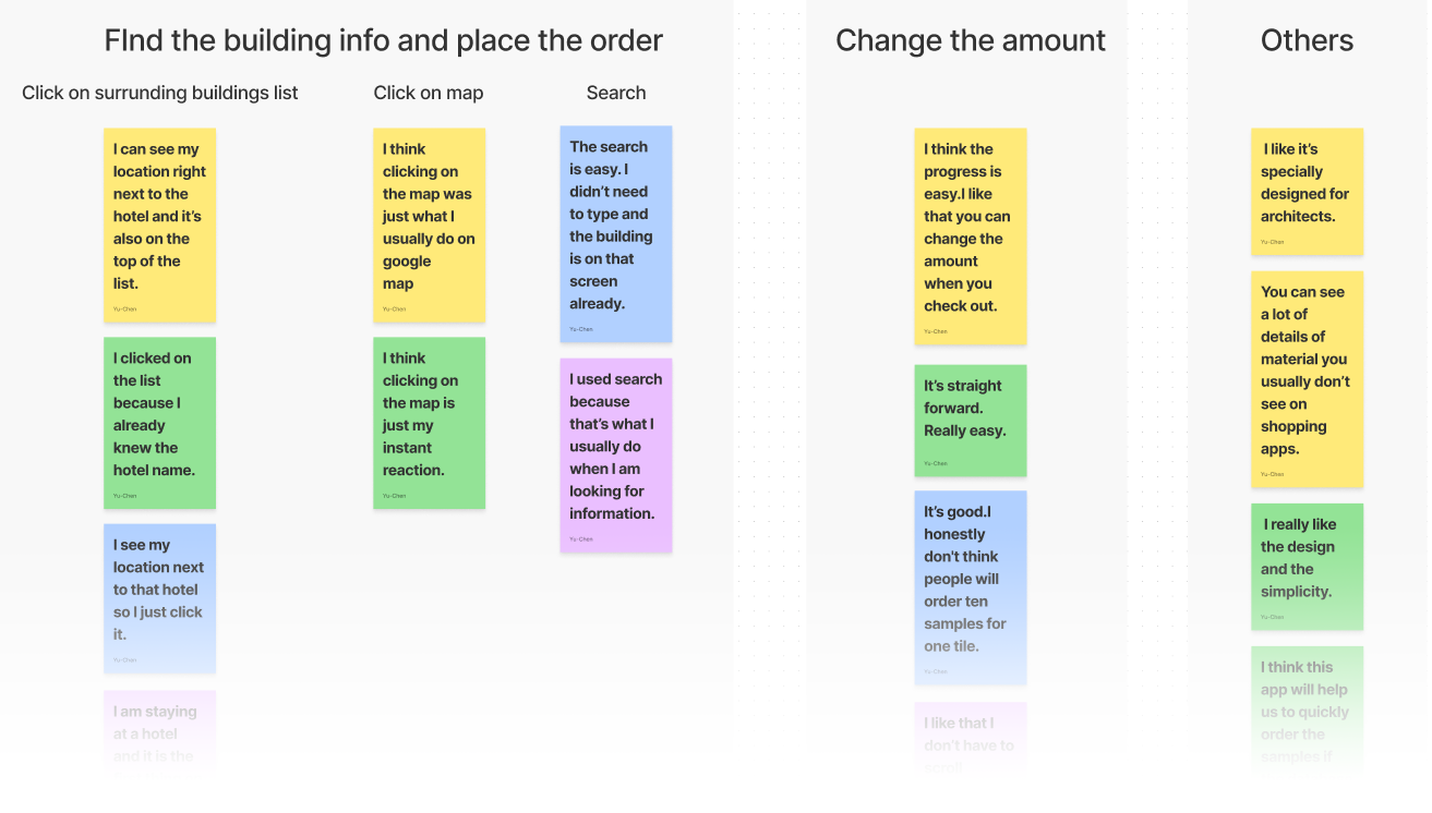
There were 4 participants who joined the usability testing for 5 tasks. All participants have work experience in the architectural and interior design industry.
Task 1: Place the order for tile sample
Task 2: Find another way to place the order for tile sample
Task 3: Change the amount of order
Task 4: Use categories in Favorites
Task 5: Use categories in Search
Test Findings
Task completion rate
100%
Task error-free rate
75%
The participants found this app to be promising and will make a good impact in the industry. They liked how easy it was to find the building and material information with great visual design and simplicity.
But the Task 4 and 5 had 75% error-free rate which were aimed to test the categories of Favorites and Search results.
2/4 participants were confused between sort and categories.
2/4 participants thought the category photos were too small.
1/4 participants mentioned the categories format was different between Favorites and Search results.
Next Steps
The participants’ feedback was really valuable. To move forward, I need to revisit the design of categories and run more tests to avoid the confusion. A card sorting exercise might be helpful to determine the categories as well.
As this project was done within a short time, there were still some features that were not completed, like personal profile, setting and the sorting. I would like to keep developing these features beyond the MVP.
Takeaway
I am glad that I can put my passion for architecture into developing an app and get really good feedback from architects and interior designers.
When I started this project, I was not sure what problems in an architect’s work routine could be solved by a mobile app. After spending more time on the research and interview, I believe the pain point I found is what architects regularly have and has the potential to be solved by advanced technology.
This project taught me that it is critical for UX designers to dig deeper to find what the user needs. I am always surprised by what I discover after the user’s interview and I believe there is always a chance to create or improve a product to make a good impact for people.