
LINE
Adding a new feature to the messaging app
Let’s make LINE better
LINE is a messaging app popular in Asia. Besides connecting with your friends and family, the LINE app also provides multiple services like mobile payment, gaming, news, etc. LINE’s mission is to bring people and services closer together.
LINE is a mature app and seems to cover everything everyone needs, but a product should keep evolving as time goes by. I would like to discover what features I can add into his mobile app and give it a refresh.
The Goal
Discover what feature the users need for the existing LINE mobile app and integrate this feature into the existing design.
Pain points
Lacking feature for work collaboration
Constraints
Adapting the current brand style
Client
LINE (This project is not affiliated with LINE)
My Role
UX researcher,
UX/UI designer
Why LINE?
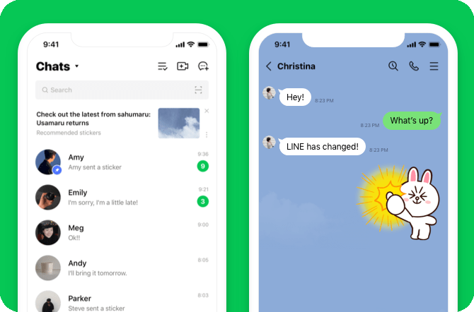
Growing up in Taiwan, all of my family and friends use LINE to communicate with each other. Even though we live in different countries now, LINE is still one of my most used apps to chat with and see my loved ones.
During the pandemic, I saw the importance of this app since I could not visit my family and friends during this time. I am researching if there is a potential to improve the communication experience.
Empathize
Audit
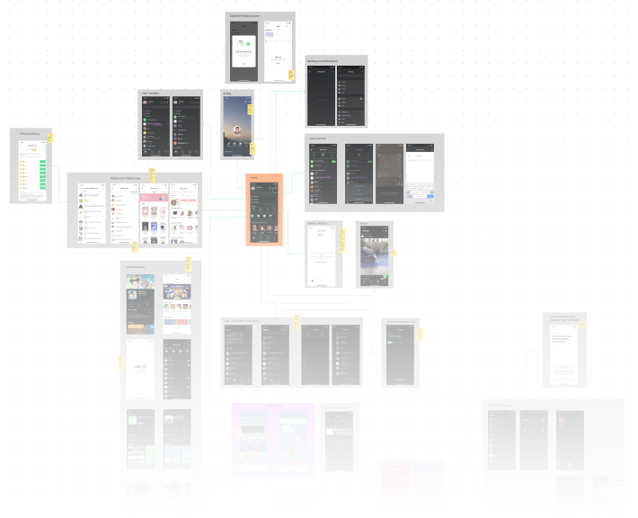
Even though I am a frequent user, I still don’t know all the features LINE provides. Here comes the audit map.
Conduct Interviews & Affinity Map
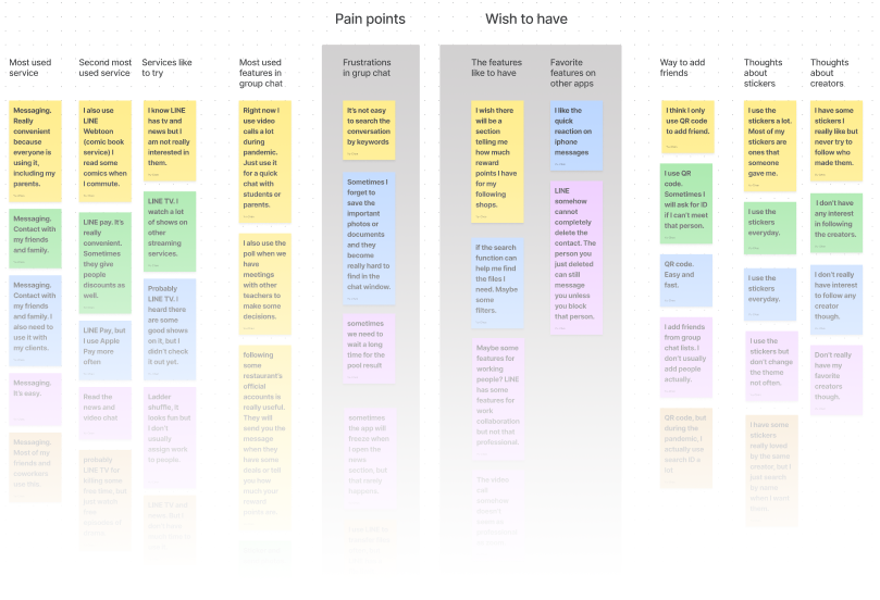
The first challenge is to find out what potential feature users need when using LINE. After interviewing 5 current users, I discovered that people started using LINE for work more often due to working from home during the pandemic, and would like LINE to have some features for work collaboration.
“Sometimes we need to wait a long time for poll result.”
“Maybe some features for working people? LINE has some features for work collaboration but not that professional.”
“I use LINE Events as well, but I have to keep going back and forth between the event page and chat window. Not really convenient.”
“I use the poll feature a lot to make decisions with my coworker, but you can’t really have the conference call on the poll page. I have to go back to the chat window then go to the poll page to vote. ”
Pains
Don’t know the work progress
Need to switch pages for poll and scheduling event
Miss the conversation and can’t find it
Can’t transfer large files
Can’t find the photo, didn’t get saved
Can’t have quick reaction on message
Needs
To know what everyone is working on
Track the work progress
Keep communication going but still organized
Easy way to search photo and conversation
Competitor Feature Analysis
The participants did not use other messaging apps often because I screened the participants before the interview, but they mentioned they still use other apps sometimes.
I compared other popular messaging apps as competitors with LINE and analyzed their strengths and weaknesses, but it seems LINE is a really mature app and doesn’t miss too many critical features, for messaging only.
Findings
Even LINE provides many services. Users still use messaging or the features in group chat.
The pandemic impacts how people use the messaging app and people would like LINE to be more work friendly.
To be able to track work progress and keep collaboration going are desired by the users.
Define
At this phase, I could clearly see adding a feature to improve work collaboration could make a good impact for people, but I need to define what feature the users really need.
Introducing Ivy, a project manager trying to lead the team during the pandemic.
Ivy’s POV
“My team is using LINE more often since we started working from home during the pandemic.”
“It’s so frustrating that some people can’t follow up the conversation. There are too many lines in the chat window”
“I thought I just mentioned our next steps but some people still don’t understand what we should achieve”
“When I have new tasks for the team
I want to assign them quickly and let everyone see the status
so the team and I can track the progress and know what’s the next step.”
Ideate
So, how might we help Ivy and her team to have better communication about their tasks on LINE?
The concept of this new feature started forming. I would like to develop a feature in group chat to let people create a task list. Everyone can see this task list, update the status, and see the next step. The manager can also use this list to check the work progress. The task flow chart below presented my original idea.
Task: Create and assign a new task to a member in the group chat
The original idea of user flows was when everyone enters this Task feature, they will see the task list and glance at the progress, then each member can go check each person’s and their own task card to understand what they should do. People can also check each task to see who is on it now.
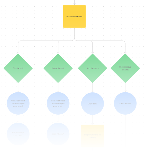
When I was sketching, I realized it would be difficult for users to keep switching screens for this feature which was one pain point from interviews, so I decided to have the multiple swiping cards on top of the group list to reduce the extra taping.
Design
Wireframes
There were 3 participants joining the first wireframes testing. All participants are senior or have longer work experience in their team.
The test results were not well received. Participants were confused by some buttons and suggested removing some features. But most importantly, participants thought this feature should be built on assigning multiple people to one task, not assigning one person to one task which I started from.
This was really helpful feedback, so I revised the wireframes below and prepared to add more detail for the next round.
Mid-Fidelity Mock-up
There were 3 participants joining the testing. All participants are senior in their team as well.
For this mock-up, I followed the branding and color palette of LINE and added some details. It is not completed yet but reached the point that the participants can understand the icons and buttons.
This testing was more successful than the last round and got really good feedback. All participants finished the test and gave me some suggestions. The most important one was that the users felt the task list was overwhelming when starting the feature.
Based on this comment, I revised the task list to be halfway hidden when the users start this feature. The users still can pull up the list to view all the tasks.
High-Fidelity Mock-up
Test
See LINE in action
There were 4 participants who joined the usability testing for 2 tasks, and all of participants are at senior positions in their team or company.
1. Assign a task to one team member.
2. Edit the existing task.
Test Findings
Task completion rate
100%
Task error-free rate
100%
3/4 participants clicked the card instead of the edit icon to edit the task. This reaction actually made sense because most mobile apps with card design let the users click the card for editing.
1/4 participants also thought the buttons might be too small to click.
Next Steps
Based on the feedback, to make the users click the card for editing instead of clicking edit button is a must for the next iteration.
Some participants would also like to see how other functions work, like the filter, sorting, and select date, etc. These will all make this new feature more completed and will be my first priorities for the next iteration as well.
Takeaway
At the beginning, I was worried that LINE was already mature and I might not be able to find any potential to improve the user experience, but what I learned from this project is that an app needs to keep changing and improving to satisfy people’s needs in different time and environment. For instance, in this project, the pandemic changes how people use LINE and the users expect a new feature to improve communication.
Another thing I learned was how important it is to run testing during the design process. If I missed the first testing after wireframes, I would not know my structure was not what the users preferred and would be too late to find out at the end.