
Freedom Sojourn
A new website for a short-term rental business
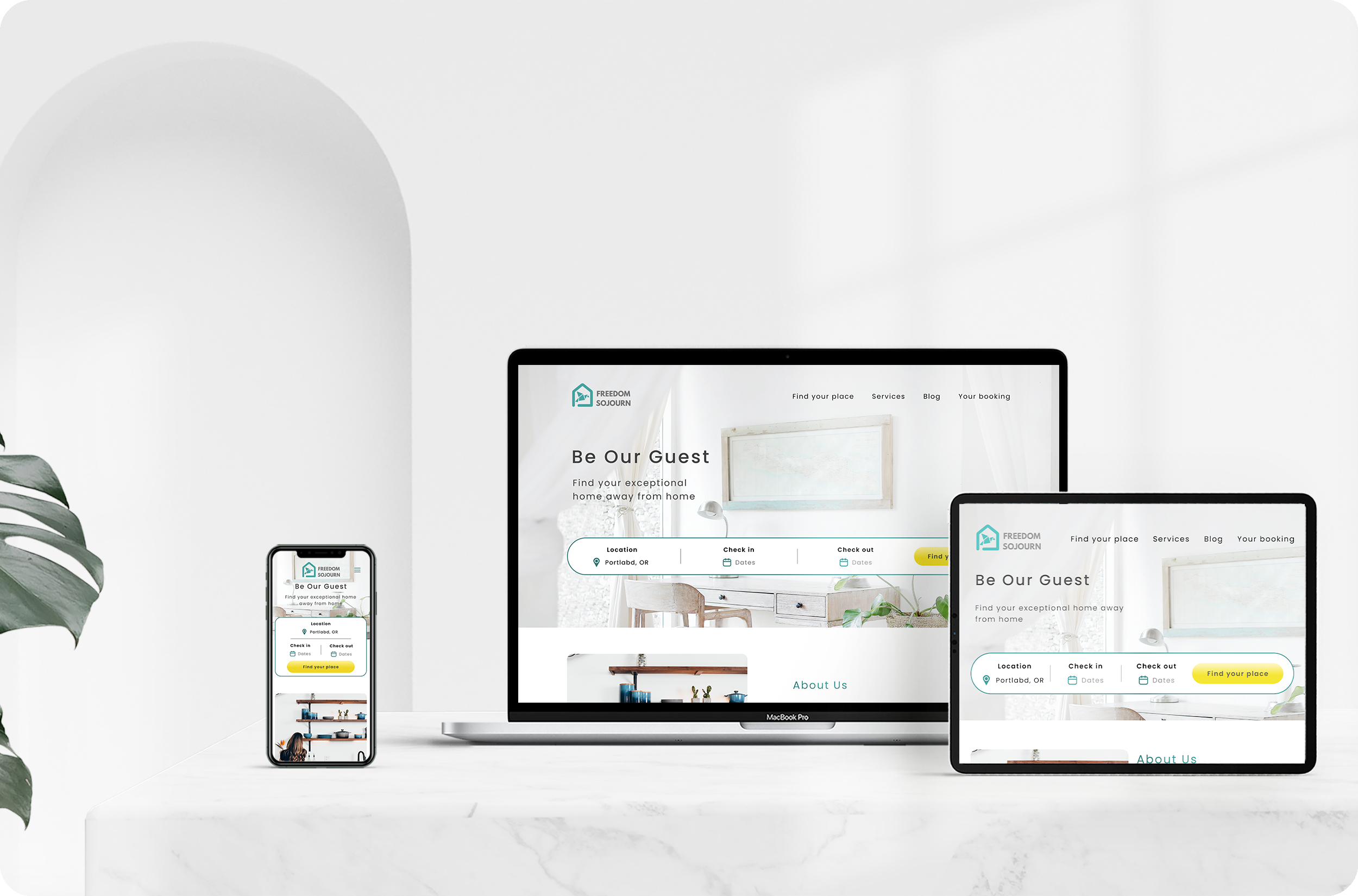
Rebuild the platform to be more user friendly
Freedom Sojourn is a young business dedicated to both travelers looking for short term stay and property owners wanting extra income with peace of mind. Whether you are traveling for leisure or work, single or a big family, Freedom Sojourn’s service is designed to serve everyone on all occasions.
The existing website of Freedom Sojourn lacks the user experience design and is hard for users to navigate and book the stay. The client would like to reimagine the website and provide a better booking experience.
The Goal
To know what problems the travelers are having right now on the short-term rental website, and what features they are looking for. Then redesign the Freedom Sojourn website to reflect what the travelers need.
BEFORE
AFTER
Pain points
Cannot book online and difficult to navigate the existing website
Constraints
Client has minimum staff for website maintenance and own branding style
Client
Freedom Sojourn
My Role
UX researcher,
UX/UI designer

Collaboration
Laney just started her short term rental business in Portland and Reno. At the beginning, Laney just quickly dropped some pictures into the website template, but then she realized the website was working poorly and the users couldn't easily find the property.
This project is a big challenge for me since Laney already had her idea of a website and the branding image she created. We talked multiple times during the process and collaborated together with her perspective and my skills to reach the result we were both satisfied with.
Another interesting request from Laney, but not necessary to apply to the website, was that she wanted to see if I can find out what services or amenities the travelers are looking for during travel from user interviews, so she can provide better experiences and help this business to grow.
Empathize
The problems with the existing website
To find out what problems the users were struggling with on short-term rental websites, I invited five participants to do a task on the existing Freedom Sojourn website and monitored the progress.
“I prefer to book the place online.”
“There should be a search function for the available dates and book directly.”
“I need to read many reviews before I book the place.”
“I cannot exit the photo view.”
“I don’t like to email back and forth with the owner.”
“I need to know the location and a more detailed description of each place.”
Pains
Need to talk to the owner for booking
No detail and description of property
Cannot search the property
Poor photo viewing function
Needs
Book directly on website
See the location and detail of property
Search available date
Easy to view the photos
Read the reviews
Competitor Analysis
Since the client’s business is focusing on Portland and Reno, the direct competitor should have their business focusing on these areas as well. After the research, the direct competitors have more properties, but their websites are not keeping up-to-date.
I also chose two indirect competitors whose businesses are both crossing the United states. With more business resources, those two indirect competitors’ websites are more trendy and have more features for me to study. I discovered Landing, a trending website that provides more details of properties, search options, and online booking, is a great competitor for Freedom Sojourn.
Findings
Seeing the photos and knowing the location of property before booking is important for travelers.
The travelers prefer to see available dates and book directly on the website.
Reviews play an important role to help the travelers make the decision of booking.
Define
The persona and empathy map were developed at this phase. Giving Sasha a background story helped me to see the user’s needs and pains more clearly.
Even though not all of Sasha’s thoughts were related to the experience of a booking website, the whole personality development still led me to discover what decisions Sasha makes in her daily life.
Sasha’s POV
“I am not comfortable to book the place without seeing its location on a map”
“I don’t want to coordinate with the owner for booking.”
“My schedule is so tight, I need to find a place to stay quickly.”
“When I see the property I like
I want to see if it’s available and book it immediately
so I can worry about packing and other things on my checklist.”
Ideate
So, how might we help Sasha to find a place she likes and book it quickly?
I set up the project goals and discussed with client to have a clear vision of what should be developed for roadmap and sitemap. Since the client just started her business and doesn’t have staff for technical maintenance, the technical goals were more for the future.
Feature Roadmap & Sitemap
Setting up the feature roadmap for the current business was not difficult since the client has an existing website already. The challenge here was how to have more features for future business growth.
The client would like to have the service to help other people start their own rental business, so it’s important to have a page delicate for that. The client also has a fun idea to create her own merchandise which means a potential online shop might be a great feature.
After reviewing the roadmap with the client, she decided to have a more simple website at this stage since she doesn’t have many staff to maintain the website and customer service. This helped me to create a really efficient sitemap for the users.
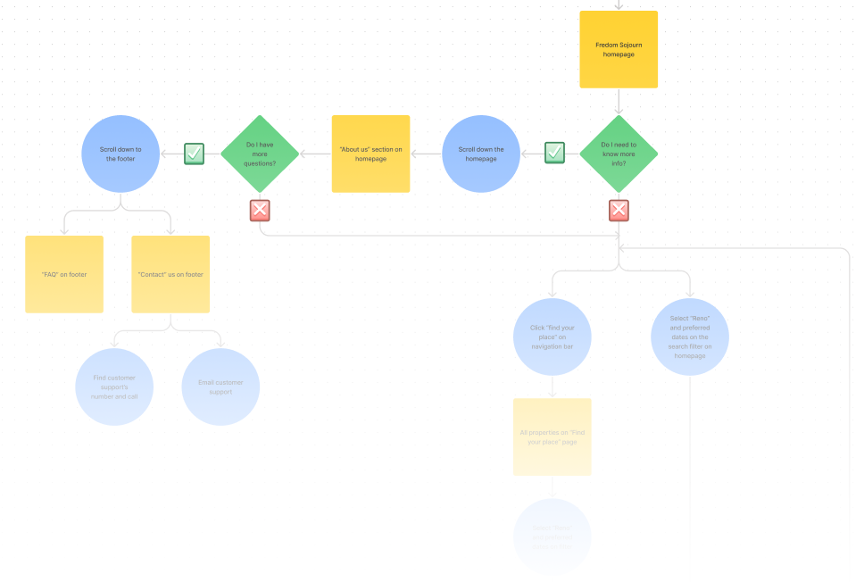
Task Flows & User Flows
So how could we grab the user’s attention to the search feature and how much detail of property we should provide to the users?
These were two main pain points from the user’s interview and also critical to keep the user flow going. The task flows and user flows helped me form some ideas about the search feature, and led me to revisit the competitors’ websites again for the property details.
Task: Find the property through search function on homepage
To make users easily start their search right after entering the website, I sketched a few ideas at the beginning then decided to combine option 1 and 3 because both options had center search bar to grab the users’ attention quickly.
Design
I started the style tile and wireframes at the same time at the beginning of the design phase.
I wanted to run a few tests during the design process to make sure my design will satisfy what users’ need, but also wanted the client to approve my UI design before I jump into Mid-Fidelity mock-up.
Client would like to keep the logo and bright yellow color, but I suggested changing the color of the logo since it’s difficult to read its shape with the neon color. I proposed we keep the yellow for the buttons to grab the user’s attention. The Poppins font was also chosen because of its modern look which was the mood the client wanted to bring into her properties.
Wireframes
There were 4 participants who joined the wireframe testing. This testing was small but the goal was to see if the users can start the search right away and the reaction of the map view.
The wireframes were well received and all participants found their way to search the properties, but none of the participants used the map view for seeing the property location during the test. I decided to add more details for the next round and see if the participants notice this function.
Mid-Fidelity Mock-up
There were a total of 7 participants who joined this test for 4 tasks.
The completion rate of the first three tasks was 85~100%, but the last task “cancellation the booking” was only 57%.
The participants seemed not to know where to cancel the booking. Here are what participants said:
“This might just be me, but I looked past the reservation number at the end of checkout. Without it, I wouldn’t be able to pull up the reservation information to cancel.”
“Might be easier to have a list of bookings instead of a reservation number. People might not be able to find the number.”
After this test, I discussed with the client and suggested letting the customers create their own account to manage their bookings. But the client worried that she won’t have enough staff to maintain the system. She will consider this feature later, but want to use the booking number to edit the stay for now.
Since the client had her own concern, I decided to add an extra “edit your stay” button and emphasized the booking number on the confirmation page to improve the experience. The page was iterated in the High-Fidelity mock-up.
High-Fidelity Mock-up
Test
See Freedom Sojourn in action
There were 4 participants who have experience booking hotels or short-term rental online joined the usability testing for 2 tasks:
Task 1: Search properties, book, and pay
Task 2: Cancel the stay
I monitored their process and asked follow-up questions to see if there is any potential improvement for the website.
Test Findings
Task completion rate
100%
Task error-free rate
100%
The participants found it’s convenient to have a search function on the home page and see the detail of the property.
1/4 participants mentioned the question regarding the personal account again. I informed the participant this feature will be added to the website in the near future.
Next Steps
As this project is still in progress, there are some parts that need to be taken care of first including the pages that didn't get fully developed like the company service and blog. From the usability interview, the participants were also curious about how the filter would work with search results which should be iterated as well.
All pages need to be adjusted to be responsive for tablet and mobile platforms in near future before handing to the client and developer.
Takeaway
What I learned the most from this project was how to communicate with the client and achieve the goals we both desired. It was a bit challenging at the beginning since the client had her own ideas about the branding and visual design, but I was able to convince her to change the color palette and still keep the spirit.
I was also happy to collaborate with the client and see things from different perspectives. I learned this from our discussion about adding the feature of creating a personal account. From my side, having a personal account is beneficial for the users, but it's actually not doable from the client’s side because of staffing issue.